Search arrangements:
Dell Venue 8 Pro full review - Software ergonomics: Windows Modern UI (codenamed "Metro") - IT tutorials, reviews and articles
LIST OF AVAILABLE TUTORIALS, REVIEWS AND ARTICLES
Dell Venue 8 Pro full review (04-13-2014) - Page list
Installing a SSD (Solid-State Drive) in an IBM ThinkPad X31 (or any older computer providing only IDE ports) (05-19-2013)
Definition of software programming and development (12-04-2000)
The freeware concepts (12-04-2000)
The joy of emulation (12-04-2000)
DELL VENUE 8 PRO FULL REVIEW
A full 8-inch Windows 8.1 tablet with active stylus for less than 14 ounces
By Maxime Abbey - First published on 04-13-2014 on Arachnosoft
Introduction and buyer's background
Technical specifications
Build quality, design, dimensions
Software ergonomics: Introduction
Software ergonomics: Windows Modern UI (codenamed "Metro")
Previous page - Page 5 of 19 - Next page
Modern UI Home screen, Windows Store applications
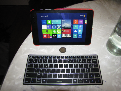
The highly-contrasted and bright screen of the Dell Venue 8 Pro enlightens Windows 8's home screen, and its famous colored tiles: the rendering on screen is very sharp, with smooth fonts, and so are fullscreen images from some applications like Bing Food & Drink.
The display defaults to three rows of tiles (or three columns in Portrait mode), which can sound rather pessimistic on a 800-pixel height (or width in Portrait mode) screen: it seems that there would be enough space to fit an additional 4th row of tiles, but it seems that Microsoft didn't choose this path, because, even with the "Show more tiles" option available on the Settings > Home Screen tiles menu, it leads to 4 rows of tiles... within roughly the same space!
You can workaround these choices, and tuneup the number and size of the tiles you're showing on the screen, by tweaking some settings on the Windows Registry, or more easily, by using an application like Metro Scaler.
The overall Windows 8 experience, which often seems rather imperfect on a non-touch enabled PC, feels great on tablet devices, and most of the "gestures" soon become intuitive: scrolling with the finger from the left side swaps from an application to another, a swipe from the top border closes the active application, and a swipe from the bottom leads to the application's contextual menu, similar to what you'd expect using the "Menu" button on an Android device.
At least, a swipe with the finger from the right-hand side of the screen gives access to the famous "Charms bar", which offers search features, links to devices and main system settings, replacing, most of the time, the classical Start menu, except to access all the installed applications, which you can reach by scrolling the tiles from the Home screen to the top.
Previous page - Page 5 of 19 - Next page
Software ergonomics: Windows Classical Desktop
Hardware design: physical buttons
Hardware design: the connectors
The hardware: display/screen, ambient light sensor, gyroscope...
The hardware: performance/CPU/RAM, responsiveness
The hardware: internal and external storage
The hardware: graphics and gaming
The hardware: Photo, video and audio
The hardware: wireless networking
The hardware: battery life and cooling
Extended features - Wireless video display on external monitor (Miracast)
Extended features - The active digitizer/stylus: description and design
Extended features - The active digitizer/stylus: technical review
Conclusion, pros and cons
Arachnosoft - Version 11.0 - Copyright © 2000-2024 Maxime Abbey. All rights reserved. Any reproduction is forbidden without authorization.


